

What is Flexbox?
Flexbox or Flexible box is used to make the layout of our web page more flexible. It is a property of CSS which helps in efficient and dynamic arrangement of items in the page. Flex basically consists of a Flex container and Flex items , which can be understood from the below diagram
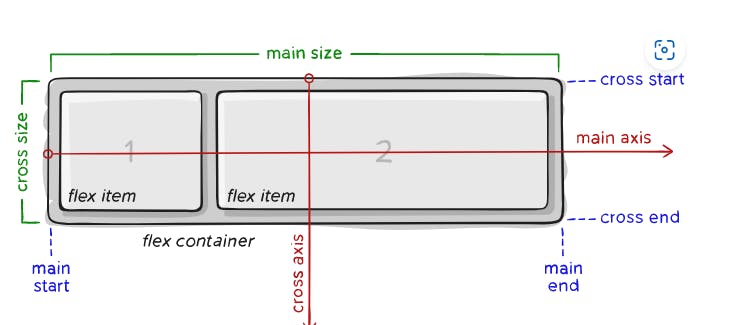
Here in this figure, the outerpart is called flex container which can be anything like a <div> or <section>. And inside that , the child elements are called as flex items.Futhermore we have below terms which are important to understand from the figure.
Main axis : This is the axis on which all flex items will be displayed .It can be vertical or Horizontal . By default flex items are placed horizontally but we can change it (using flex-direction property).
main-start/end : The flex items starts from main-start till main-end.
main-size: A flex items width or height which ever is the main axis is called as its main-size.
Other than these three we have cross (axis/start/end/size). It is just opposite to wherever the main axis exists.
Flex container
Flex container is the parent element within which flex items(child elements) are defined. Following are the properties of a flex container.
display
This defines a flex container.
Example:
.container {
  display: flex;
}
flex-direction
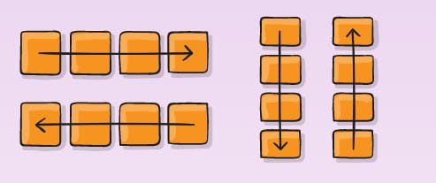
This is used to give direction to the items of flex container.There can be mainly two directions. i.e., row and column. By default a flex box is horizontal(row). Following are the directions that we can use:
- row(default) :align items from left to right horizontally.
- row-reverse :align items from right to left horizontally.
- column : align item vertically from top to bottom.
- column-reverse : align item vertically from bottom to top.
Example:
.container {
  flex-direction: row | row-reverse | column | column-reverse;
}
flex-wrap
flex-wrap is used to wrap up the items in one or multiple lines according to our need.
.container {
  flex-wrap: nowrap | wrap | wrap-reverse;
}
Following are used to wrap the items.
- nowrap (default): all flex items will be on one line
- wrap : flex items will wrap onto multiple lines, from top to bottom.
- wrap-reverse: flex items will wrap onto multiple lines, from bottom to top.
flex-flow
This is a shorthand for the flex-direction and flex-wrap properties. The default value is row nowrap.
.container {
  flex-flow: column wrap;
}
justify-content
It is use to align flex items in main axis different ways by arranging them using spaces. Following can be used with justify content.
- flex-start(default) : items are placed at the starting of flex direction.
- flex-end : items are placed at the end of flex direction.
- center: items are placed at center of the main axis.
- space-between: items have equal space between them.starting item is at main-start and ending one at main-end.
- space-around: items have equal space between them only the first item will have one unit of space from start and last item will have one unit of space from end.
- space-evenly : all items are having equal space between them including the start and end edges.
.container {
  justify-content: flex-start | flex-end | center | space-between | space-around | space-evenly | start | end | left | right ... + safe | unsafe;
}
align-items
align- items have some of the properties similar to justify-content (except some additional like stretch,baseline), the only difference is it aligns items on cross axis instead of main axis.
- stretch : stretch to fill the container in flex-direction.
- baseline: items are aligned such as their baselines align.
.container {
  align-items: stretch | flex-start | flex-end | center | baseline | first baseline | last baseline | start | end | self-start | self-end + ... safe | unsafe;
}
}
align-content
It allows to align multiple line items together.This property only takes effect on multi-line flexible containers, where flex-wrap is set to either wrap or wrap-revers.It has same same properties as align-items.
.container {
  align-content: flex-start | flex-end | center | space-between | space-around | space-evenly | stretch | start | end | baseline | first baseline | last baseline + ... safe | unsafe;
}
gap, row-gap, column-gap
The gap property explicitly controls the space between flex items. It applies that spacing only between items not on the outer edges.
.container {
  display: flex;
  ...
  gap: 10px;
  gap: 10px 20px; /* row-gap column gap */
  row-gap: 10px;
  column-gap: 20px;
}
Properties for the Children(flex items)
order
As the name suggests it changes the order of items to be displayed in flexbox. By default all the items have 0 order. if we increase it it will shift to extreme right as prior.
.item {
  order: 5; /* default is 0 */
}
flex-grow
This defines the ability for a flex item to grow if necessary. It accepts a unitless value that serves as a proportion. It dictates what amount of the available space inside the flex container the item should take up.By default each item have value 0.
.item {
  flex-grow: 4; /* default 0 */
}